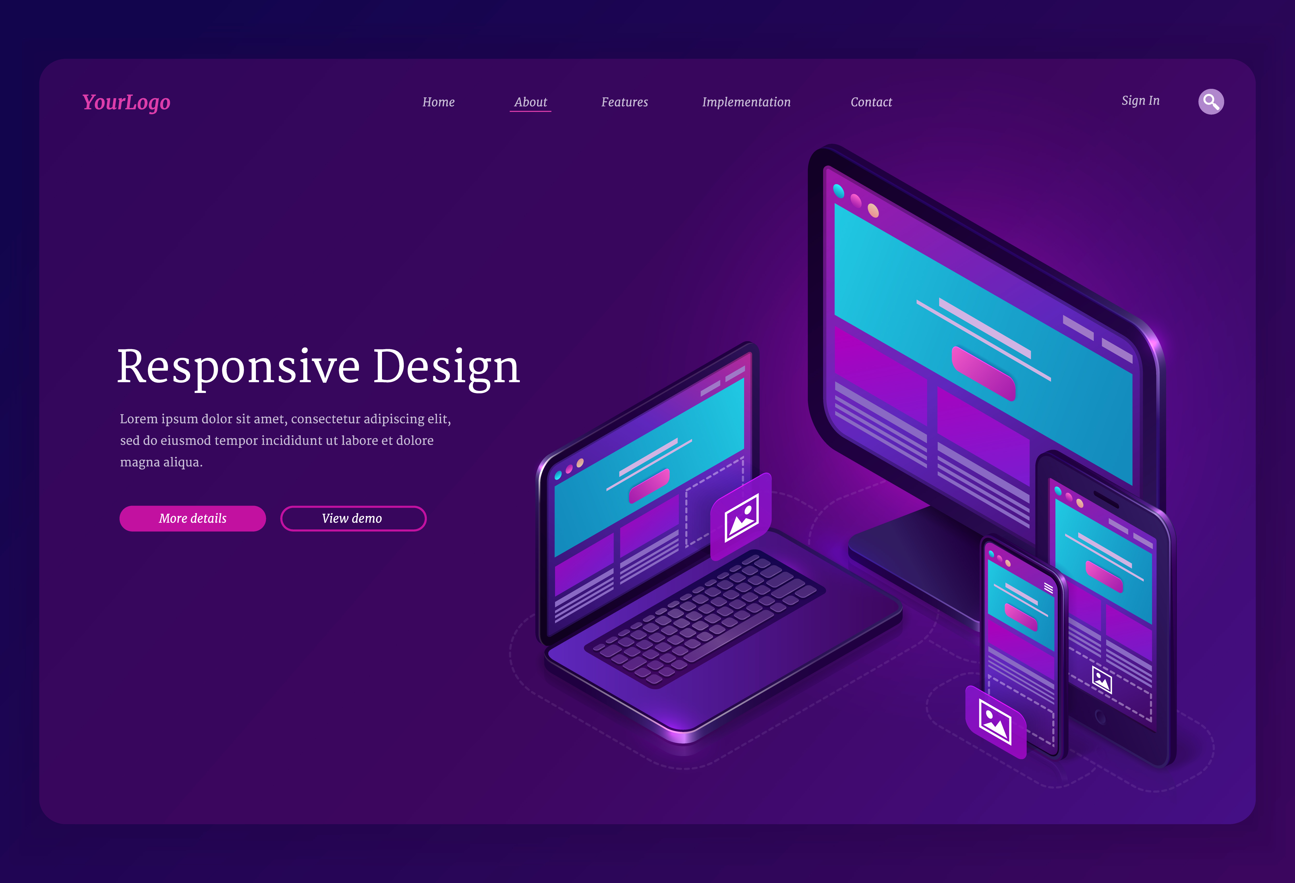
Why Responsive Design Matters
With over 60% of web traffic coming from mobile devices, responsive design is no longer optional. Your website must work perfectly on all screen sizes - from small smartphones to large desktop monitors.
💡 Pro Tip
Always design with a mobile-first approach. Start with the smallest screen and progressively enhance for larger screens.
1. Use Fluid Layouts
Avoid fixed widths. Use percentages, viewport units (vw, vh), and flexbox/grid for flexible layouts.
/* ❌ Bad - Fixed width */
.container {
    width: 1200px;
}

/* ✅ Good - Fluid width */
.container {
    width: 100%;
    max-width: 1200px;
    margin: 0 auto;
    padding: 0 20px;
}
2. Flexible Images
Make images scale with their container to prevent overflow.
img {
    max-width: 100%;
    height: auto;
    display: block;
}
3. Use CSS Grid and Flexbox
Modern CSS layout techniques make responsive design much easier.
.grid {
    display: grid;
    grid-template-columns: repeat(auto-fit, minmax(300px, 1fr));
    gap: 20px;
}
4. Mobile-First Media Queries
Write your base styles for mobile, then add media queries for larger screens.
/* Base styles - mobile */
.column {
    width: 100%;
    margin-bottom: 20px;
}

/* Tablet */
@media (min-width: 768px) {
    .column {
        width: 50%;
        float: left;
    }
}

/* Desktop */
@media (min-width: 1024px) {
    .column {
        width: 33.33%;
    }
}
5. Use Relative Units
Use rem, em, and % instead of pixels for better scalability.
html {
    font-size: 16px; /* Base */
}

h1 {
    font-size: 2rem; /* 32px */
}

p {
    font-size: 1rem; /* 16px */
    margin-bottom: 1.5rem; /* 24px */
}
6. Touch-Friendly Design
Make buttons and links easy to tap on mobile. Minimum touch target size should be 44x44 pixels.
.button {
    padding: 12px 24px;  /* Larger tap area */
    min-height: 44px;
    min-width: 44px;
}
7. Hide/Show Content Strategically
Some content can be hidden on mobile to save space, but ensure core content is always accessible.
8. Test on Real Devices
Don't rely only on browser dev tools. Test on actual phones and tablets.
9. Optimize Performance
Mobile users often have slower connections. Optimize images, minify code, and lazy load where possible.
10. Use Viewport Meta Tag
Always include the viewport meta tag for proper scaling on mobile.
<meta name="viewport" content="width=device-width, initial-scale=1.0">Conclusion
Responsive design is about creating a seamless experience across all devices. Start implementing these tips today, and your users will thank you!